Personal Brand Identity
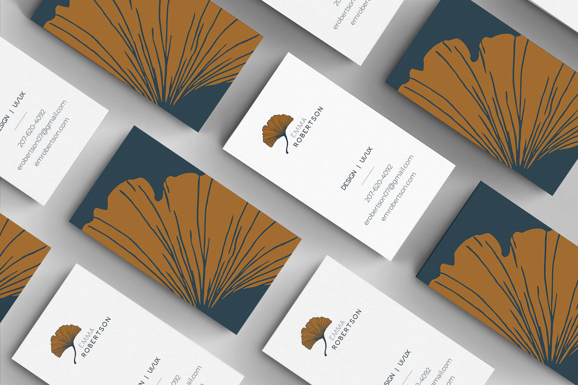
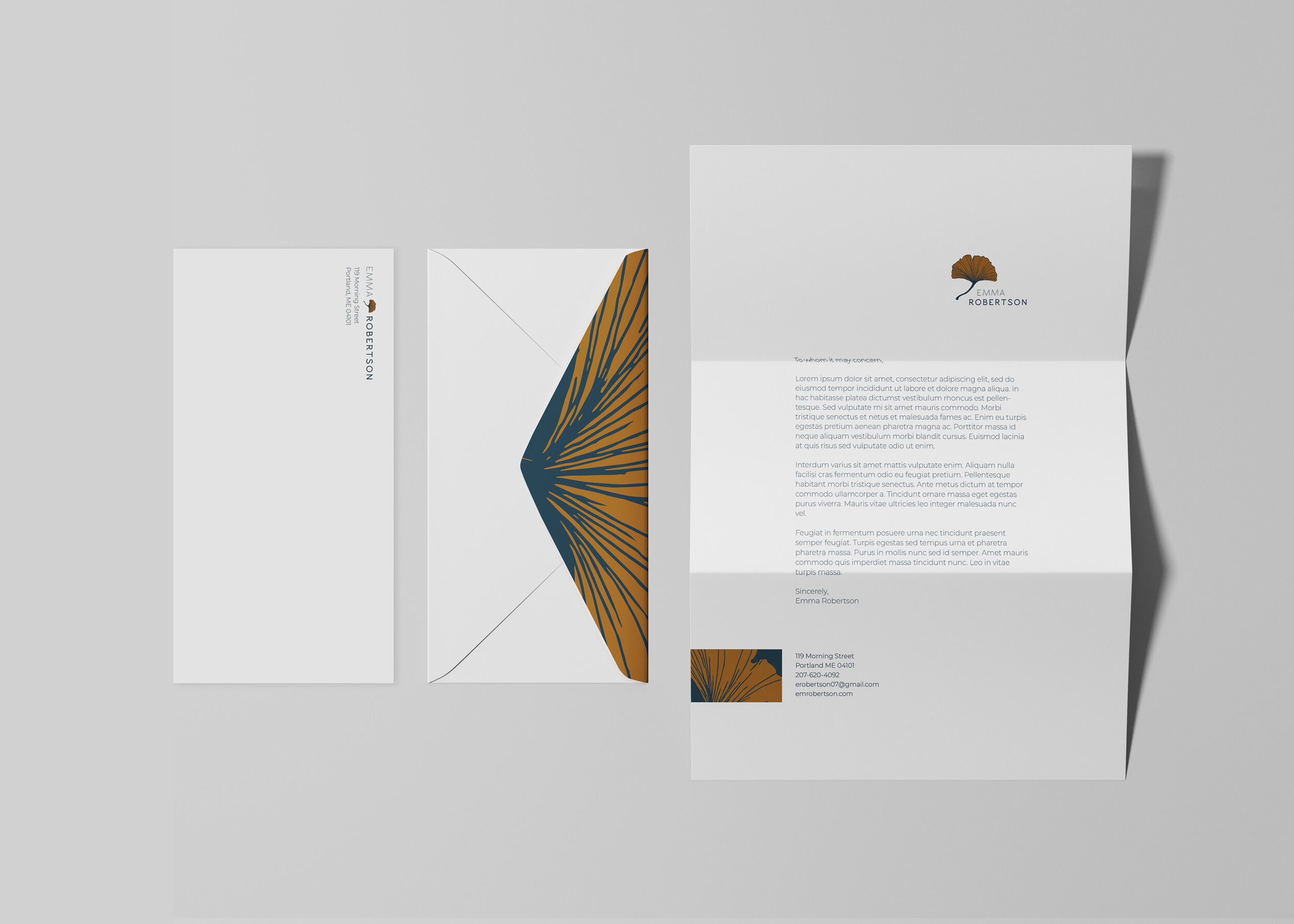
In my final semester of college, I created my brand identity. This was a fairly long process that took roughly seven weeks of brainstorming, creating, editing, and refining. In the end, I was able to create a logo, business card, and letterhead design that best represents who I am.
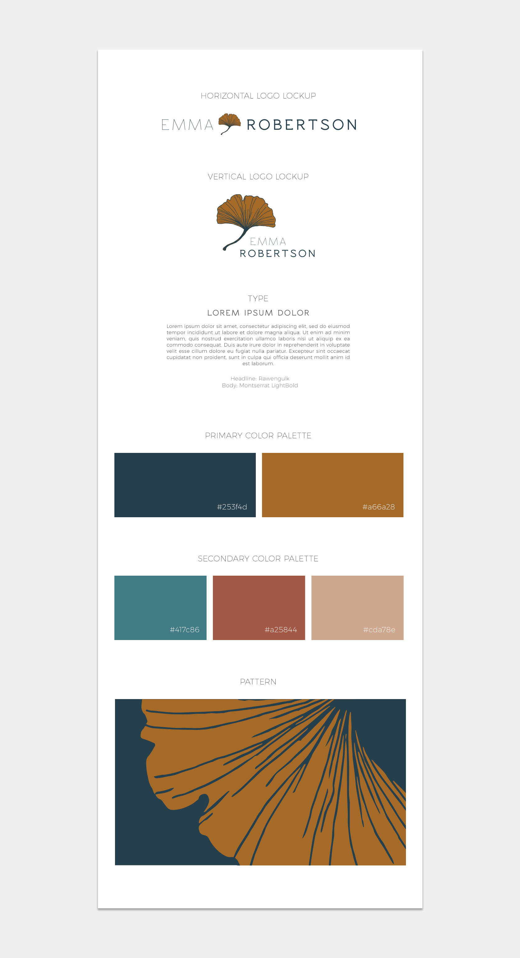
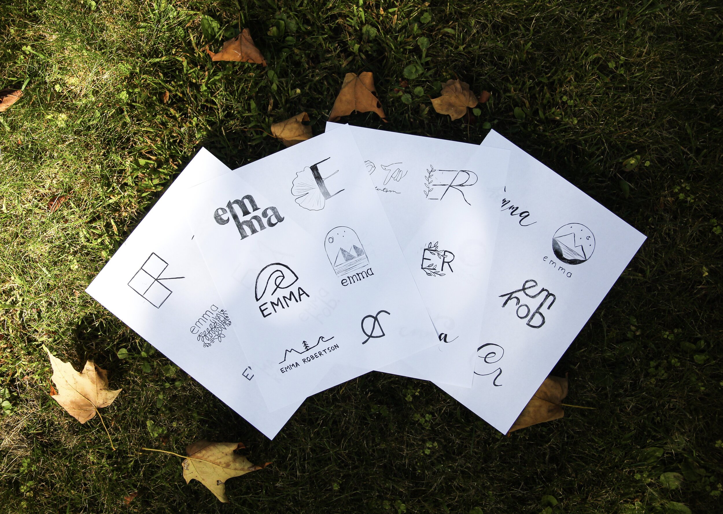
I knew from the very beginning that I wanted my logo to look organic and natural. I wanted to use fairly muted, yet unique colors. After doing extensive research, and sketching many ideas, I finally drew a symbol that really resonated with me: a gingko leaf. It was elegant and had personal ties; growing up we had a gingko tree planted in my backyard that was a gift from my grandmother. The drawing of the leaf translated beautifully to the computer, and I paired a thin and clean slab serif to fully complete my logo. I used a palette of navy blue paired with a gold, supported by a teal and a few shades of pink. It was subtle, but was still a perfect visualization of me.


